What is Mobile SEO and how to get started?
Mobile SEO is the process of optimising your website for mobile devices making sure it is aesthetically pleasing and functions properly on mobile devices regardless of the screen size. The use of mobile devices has increased dramatically in recent years. Consumers currently use mobile devices for 76% of their shopping. As smart devices become more widely available, this percentage is only anticipated to rise. Many businesses are unaware of the value of a mobile-friendly website, but if you don’t have one, it will harm both your SEO and how your audience views your company. In fact, statistics suggest that around 52% of users are less likely to interact with your business again due to a poor experience. If you wish to prevent bad mobile experiences, you must optimise your site with the best SEO strategies for mobile devices.
Mobile SEO Vs Desktop SEO
- SERPs: The design of the search engine result page is the biggest difference between SEO for desktop and mobile (SERP). Google doesn’t have enough room for two columns because mobile devices have smaller screens than desktops. This means that fewer results will appear on the first page and that anything to the right of a desktop search result will stack above or below organic search results; this is especially advantageous for sponsored listings (pay-per-click results).
- Location: Modern mobile devices come equipped with a Global Positioning System (GPS), which gives search engines more precise location information than desktops. This is a key factor in the vastly greater variability of mobile search results compared to desktop search results.
- Screen size: Google adjusts search results to fit the user’s device. This impacts the number of results displayed on the page. The SERP layout underwent additional alterations as tablets were made available on the market.
- Phone operating system: Operating systems have an impact on mobile search results as well. This is particularly true if Google determines that the query may be app-oriented. In this scenario, search engines are more likely to display grids of app icons that connect directly to apps in the App Store. App packs are typically not featured in desktop results because the majority of apps don’t function on a desktop.
How to check for mobile SEO keyword ranking and traffic?
If you wish to check your mobile SEO, using Google’s mobile page testing tool is a simple approach to determine whether a page is mobile-friendly. However, it is recommended to check whether your website is mobile-friendly before making any significant modifications to increase your mobile SEO. The best aspect is that you can determine how mobile-friendly your site is without loading every page on your phone or another mobile device. You can directly go to the website and conduct a Google search for the mobile-friendly test. Simply enter the URL of the page you wish to verify and click “Test URL” to complete the process. The Mobile Usability report makes testing your entire site considerably easier if you utilise Google Search Console. This will evaluate your website’s responsiveness on mobile devices and classify URLs according to the issues. Once the assessment is complete, you will have a better idea of the work you need to do for your mobile SEO strategy.
Mobile SEO Best Tactics
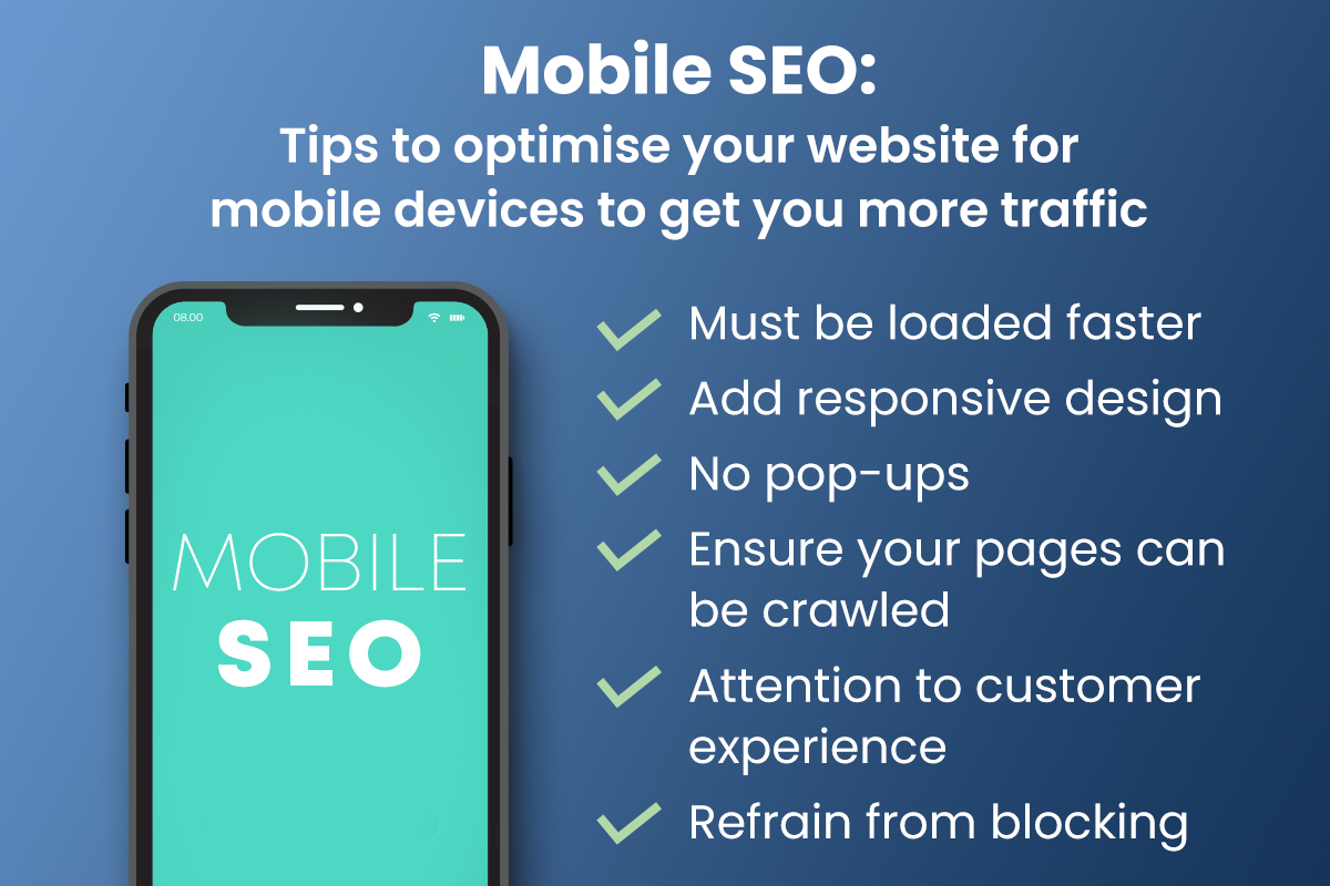
1. Make your website’s load time faster
The mobile experience is significantly impacted by how quickly your site loads. Users demand quick access to information when they do on-the-go searches for it. Your viewers will leave your page if your website doesn’t load quickly enough for them.
2. Add responsive design
A website must have a responsive design in order to be mobile-friendly. By utilising responsive design, you make sure that your website can be viewed on any device. Your audience will receive the optimal mobile experience for their device, whether it is a smartphone or tablet.
3. No pop-ups
No one likes pop-ups, let’s face it. Additionally, pop-ups on mobile devices are even worse because they can completely fill the screen and are difficult to dismiss. They are irritating and frustrating, leading to a higher bounce rate.
4. Ensure your pages can be crawled
How can Google determine whether your page is mobile-friendly if it can’t crawl your complete page and content? Furthermore, you absolutely want Google to be aware that your website is mobile-friendly! Go to Google Search Console to see whether you are unintentionally hurting your SEO by blocking information by preventing it from being crawled.
5. Pay attention to customer experience
The user experience must be your main priority if you want to succeed with mobile-friendly SEO. For instance, since consumers typically surf with their thumbs on mobile devices, you will need to design with this in mind.
6. Refrain from blocking JavaScript, CSS, and images
CSS, JavaScript, and all image kinds weren’t supported earlier and hence blocked as a result. These elements can now be viewed on the majority of devices, thus they shouldn’t be restricted since Google wants to recognize them for classification.
Get the Mobile SEO Support You Need With Bakoffis Digital Marketing Agency
Mobile search is expanding and doesn’t appear to be slowing down. To this end, are you prepared to use the best SEO strategies for mobile devices? Bakoffis is here to help you. As a leading SEO agency, we are committed to improving your mobile SEO.
Wait no more! Get in touch with us if you haven’t made your site mobile-ready yet, or just need a few tweaks!